To size something as tall as the viewport, you can use the vw and vh units.
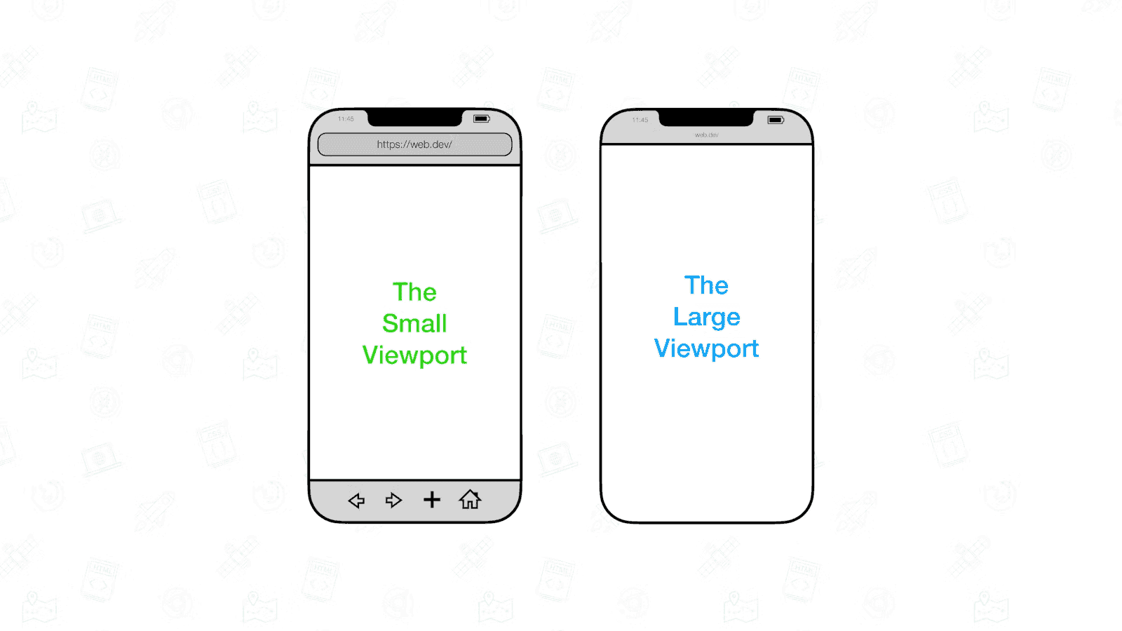
There, the viewport size is influenced by the presence or absence of dynamic toolbars. These are user interfaces such as address bars and tab bars
To solve this problem, the various states of the viewport have been specified at the CSS Working Group.
Large viewport: The viewport sized assuming any UA interfaces that are dynamically expanded and retracted to be retracted.
Small Viewport: The viewport sized assuming any UA interfaces that are dynamically expanded and retracted to be expanded
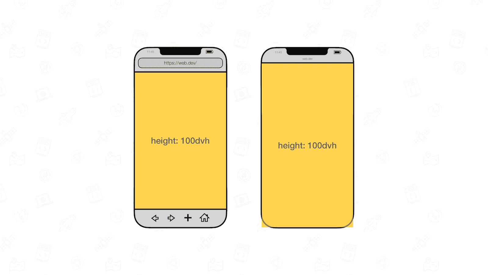
Units representing the large viewport have the lv prefix. The units are lvw, lvh, lvi, lvb, lvmin, and lvmax.
Units representing the small viewport have the sv prefix. The units are svw, svh, svi, svb, svmin, and svmax
Its accompanied units have the dv prefix: dvw, dvh, dvi, dvb, dvmin, and dvmax. Their sizes are clamped between their lv* and sv* counterparts
None of the viewport units take the size of scrollbars into account. On systems that have classic scrollbars enabled, an element sized to 100vw will therefore be a little bit too wide
The values for the dynamic viewport do not update at 60fps. In all browsers updating is throttled as the UA UI expands or retracts. Some browsers even debounce updating entirely depending on the gesture (a slow scroll versus a swipe) used
The on-screen keyboard (also known as the virtual keyboard) is not considered part of the UA UI