Links to This Note1
Market 6
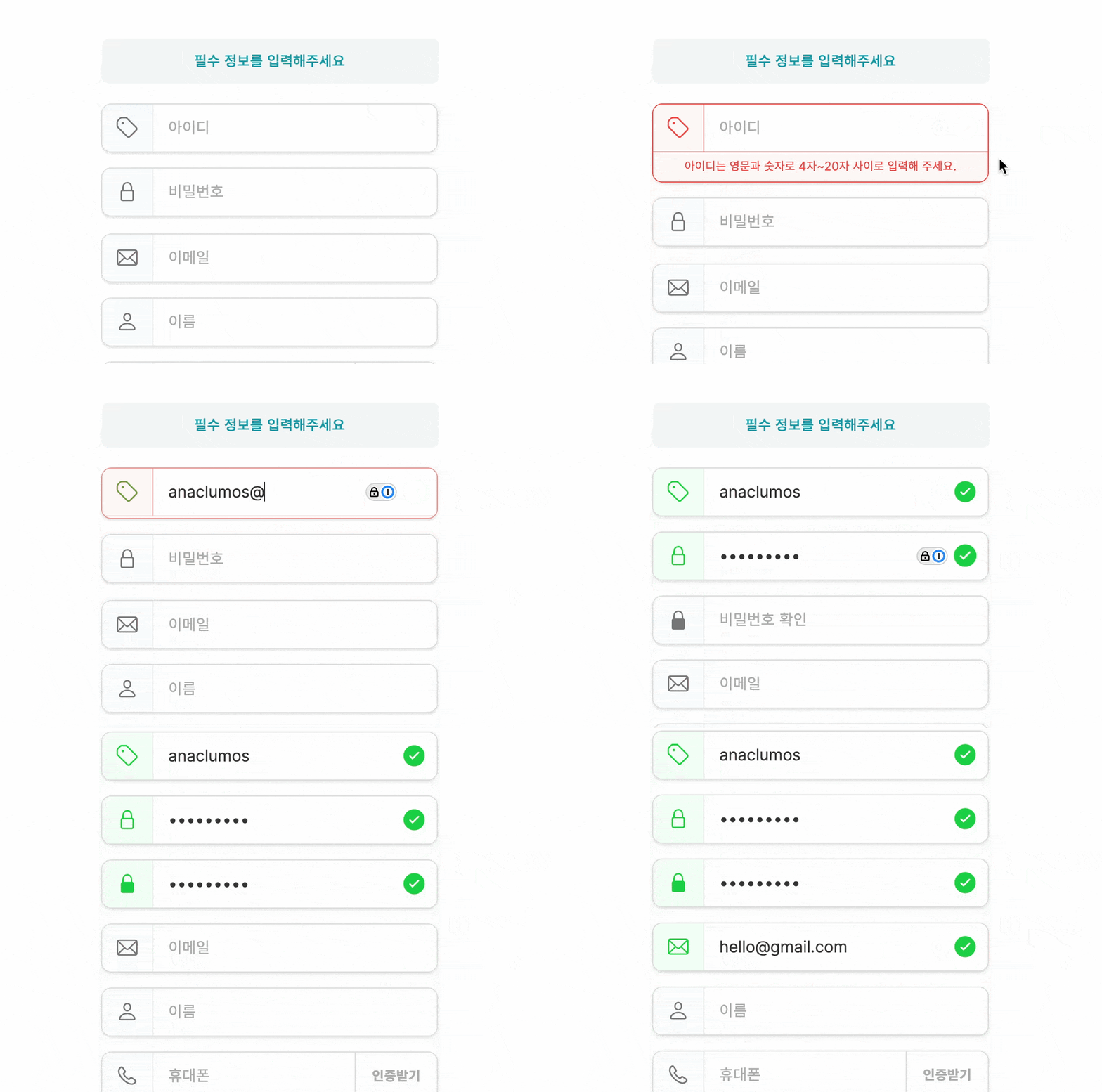
Gave me chills since the first day of looking at this. I still think this is the GOAT of user field interactions UI
I dissected it with jhaemin (Jang Haemin) and figured it's dynamically adding JS classes with height transition animations. The "error messages" are clipped and hidden underneath. When there is an error, JS adds a class that makes the element higher, thus revealing the message. Paired with bunch of CSS transform animations.
